I then started thinking about how the term ‘impossible’ could be interpreted:
- Not able to occur, exist, or be done
- Very difficult to deal with- utterly impracticable
- Incapable of being true
- Hopelessly unsuitable, difficult, or objectionable plan
This could then be applied to a physiological object or an philosophical ideology. Here are some of my initial ideas- A massive paintbrush being dipped into a lake, a bridge built with a huge deck of cards, and a metal frame that looks at the ocean, as if it was a painting on an easel.
However I didn’t really like any of these initial idea. I wanted to go more conceptual with this piece. Therefore I needed to describe an impossible feeling, emotion or thought through sculpture. Then Valentines day came and me and some of my flat mates started talking about how people know when they are in love. My friends that have experienced that feeling all simultaneously stated the fact that it’s impossible to describe. And then an epiphany! LOVE! I started brain storming the classic tropes that people associate with love:
- Lighting up their world
- Burning desire
- Electricity
- Chemistry
- Butterflies in their stomach
- Hearts
- Pairs
- Bouquet of flowers
- A range of colours
This list has been inspired by popular rom coms (discussed in artist influence page). After analysing these films, I realised that the relationships and stories explored in these films imprint certain expectations about how love should be in real life. Researchers claim that the unlikely happy endings, improbable plots, perfect sex and faux philosophy are to blame. Film directors oversimplify the dynamic process of falling in love, wrongly giving the audience the impression that this could be achieved in real life with no problems, effort or time. We tend to only see the exciting period of falling in love, rather than the commitment and trust that are required for this feeling to maintain between two people over years to come. The fact the 50% of marriages end in divorce implies that love very rarely endures.
~Kitsch~
“Art, objects, or design considered to be in poor taste because of excessive garishness or sentimentality, but sometimes appreciated in an ironic or knowing way”
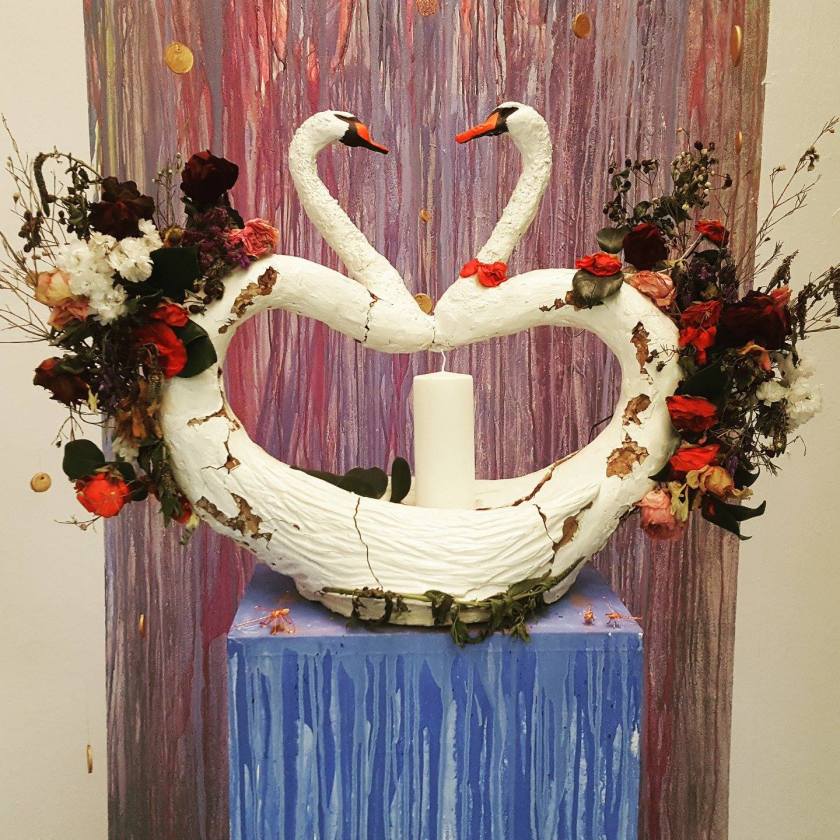
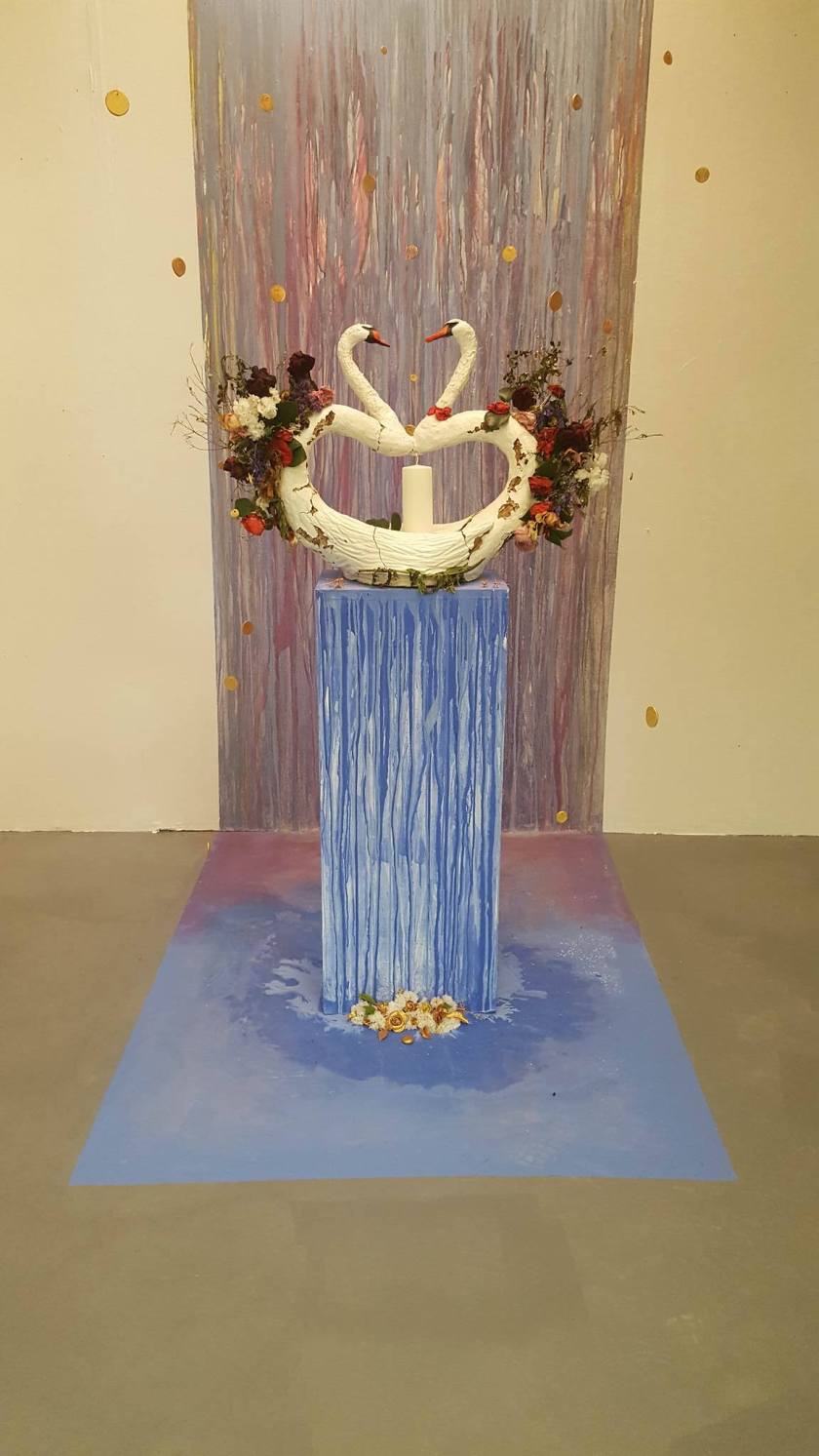
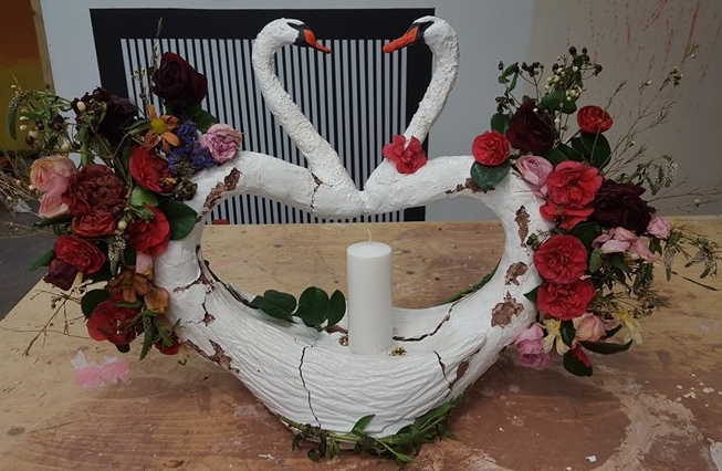
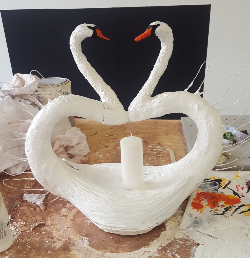
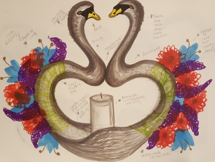
My aim was to initially create a sculpture that illustrates the impossible description of love (based on cheesy tropes). However, as an artist I will allow nature to intervene with my work, allowing its effects to depict the reality of love- that it eventually lessens and dies. Thus, the essence of Kitsch is present as the piece appears to be deeply sentimental, whereas the exaggeration and explicitness of the themes suggest a more satirical understanding. Having natural forces break the sculpture emphasis the presence of Kitsch.
It was time to sketch again…
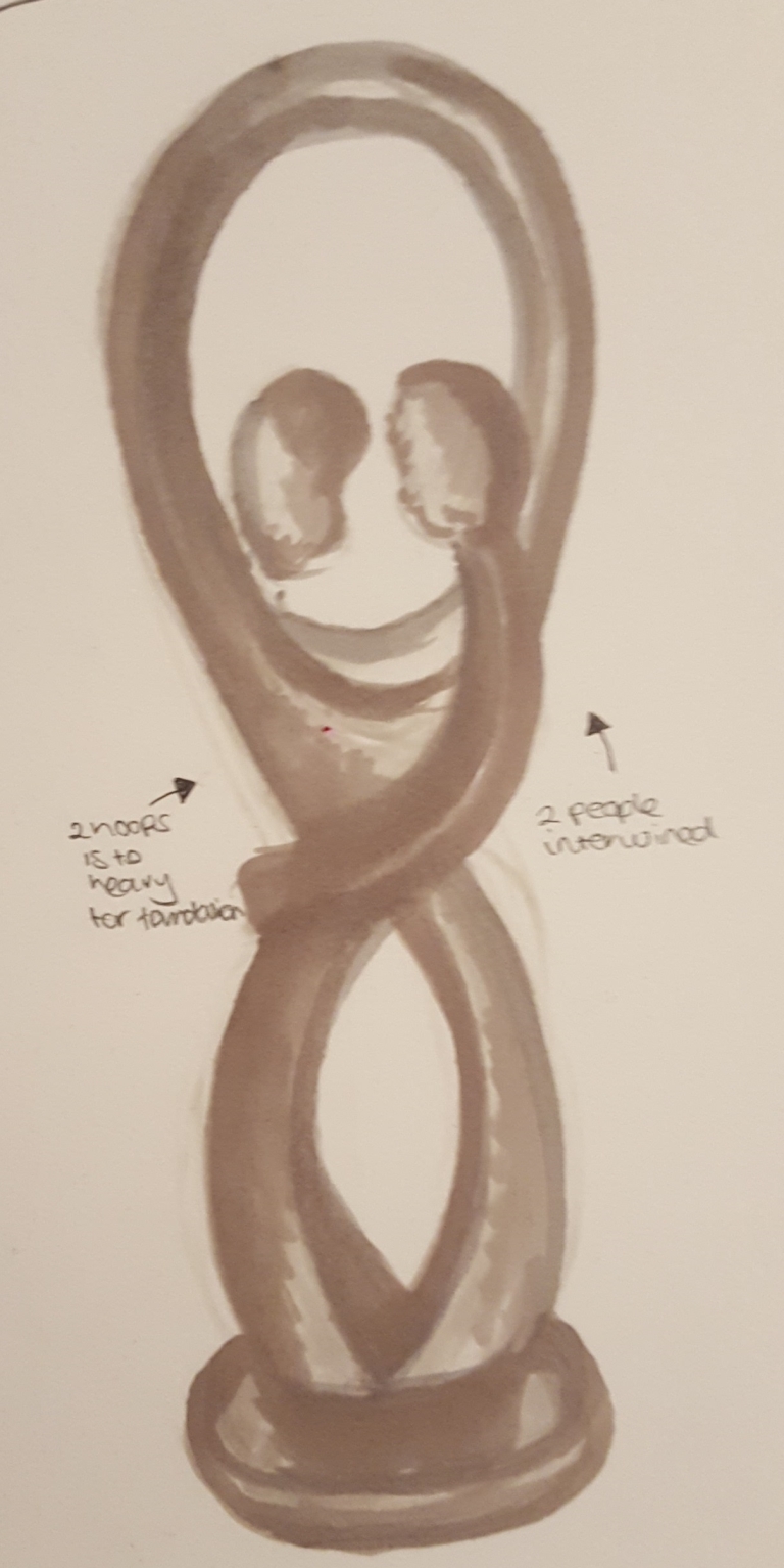
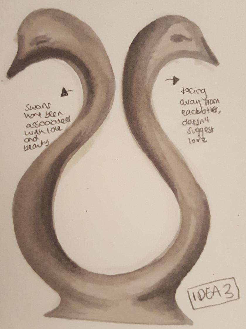
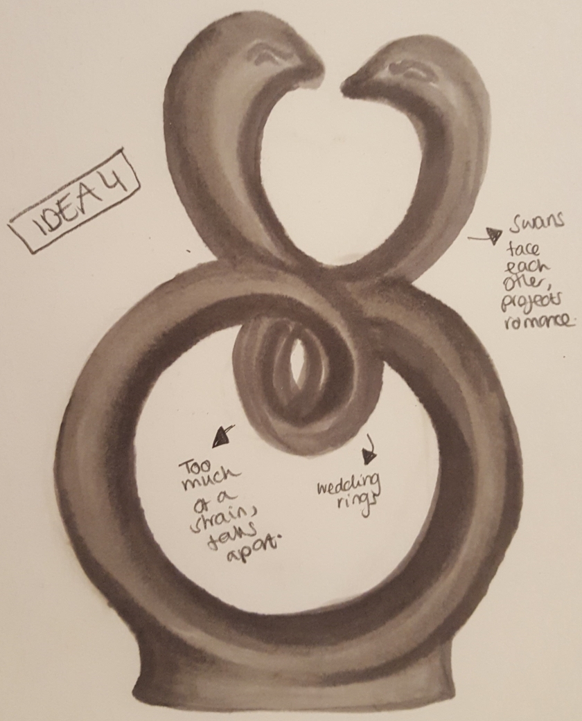
IDEA 1- Two bodies intertwined with one another, in perfect harmony. With them facing each other creates a deep sense of intenseness. The arch sheltering the couple suggests that they are safe in their bubble of love.
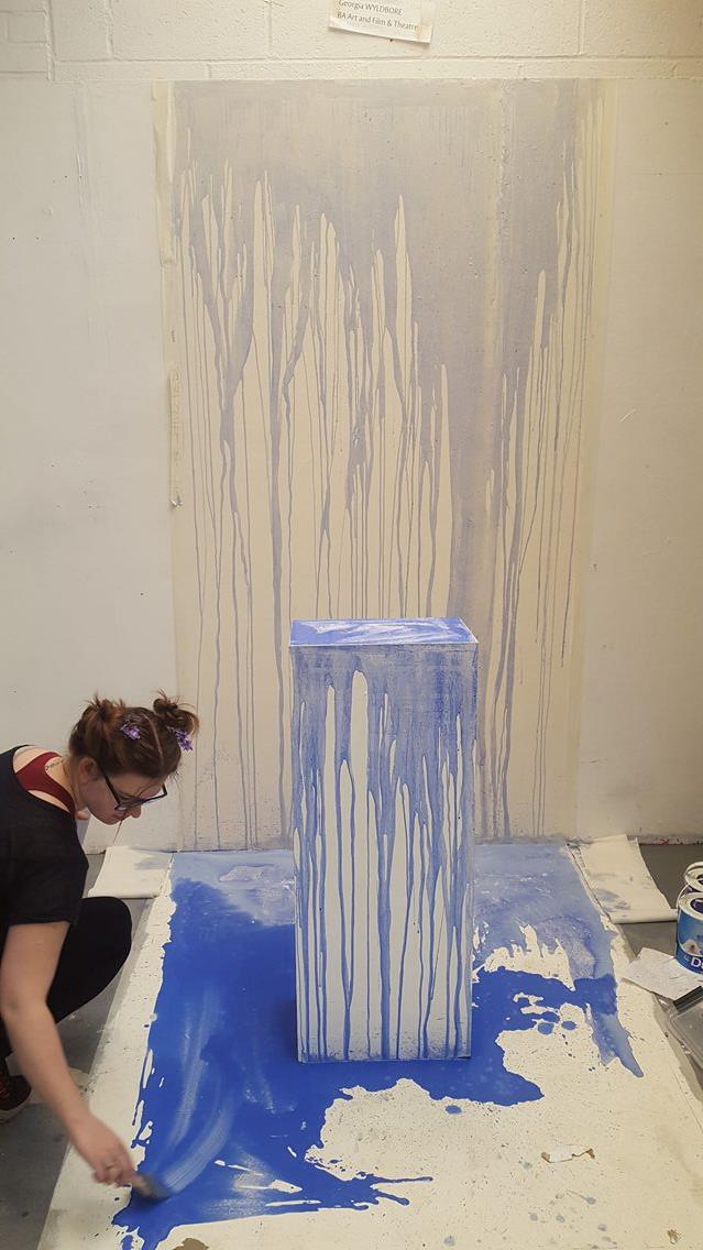
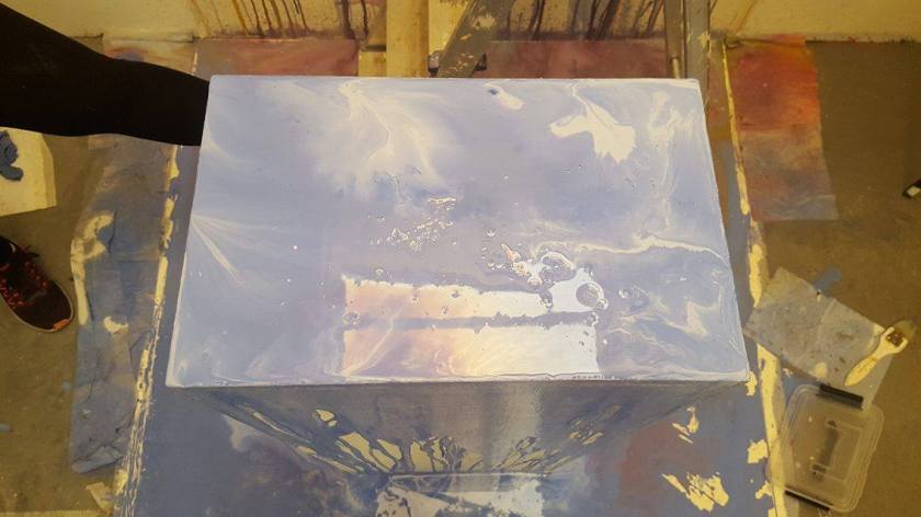
In the seminar session I shared my idea with the class, where Enno and Georgia felt quite a liking to the concept. Would the impossible telling of love be better shown as a collaboration I wondered? Enno’s idea involved the ice melting which could relate to ‘love melting away’. Georgia was thinking about making beautiful figurines of butterflies, so beautiful that they were fake. Again this relates to kitsch and how some claim to feel butterflies in their stomach when they are falling in love. However this idea didn’t pan out in then end we left the option to work together when curating. All I needed now was materials to sculpt with.


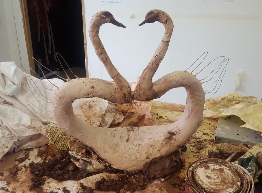

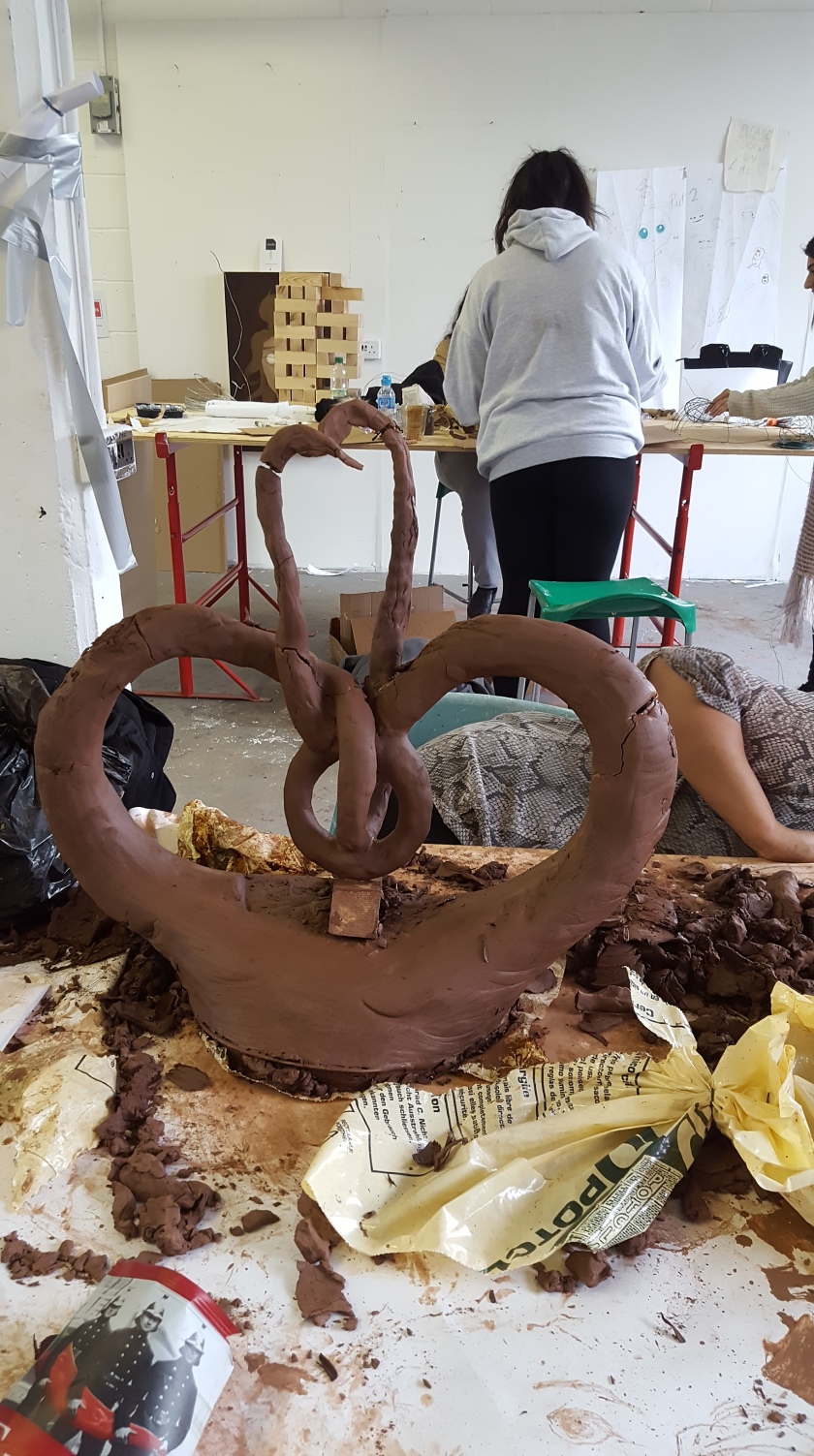
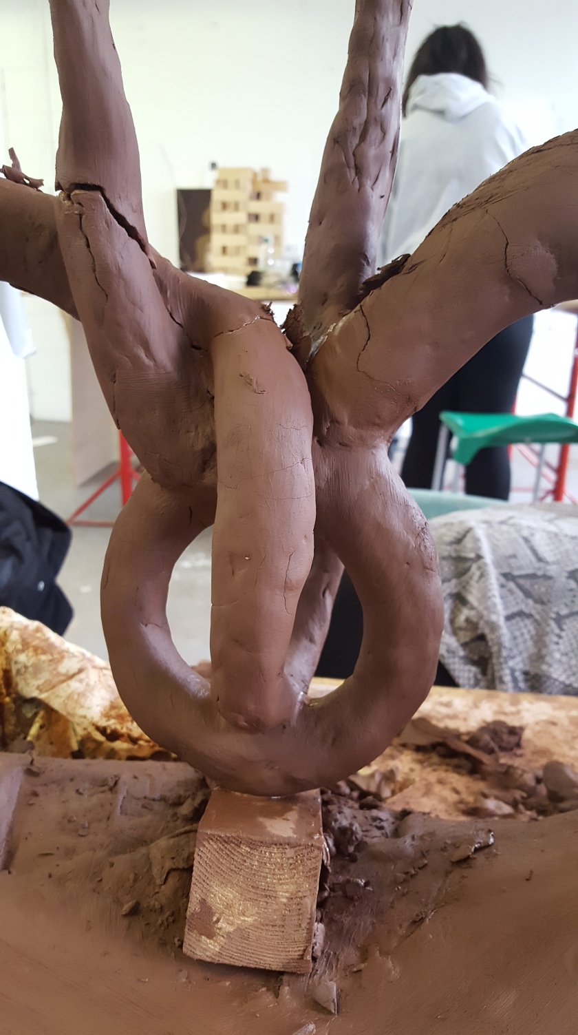
 Unfortunately the weight of the added clay resulted in even deeper cracks. After trying to salvage it for a week, I realised the design was to improbable to make, because the chosen material was physical to heavy. It was essential that I altered my design.
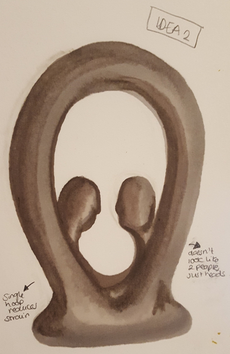


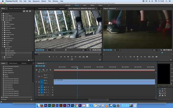
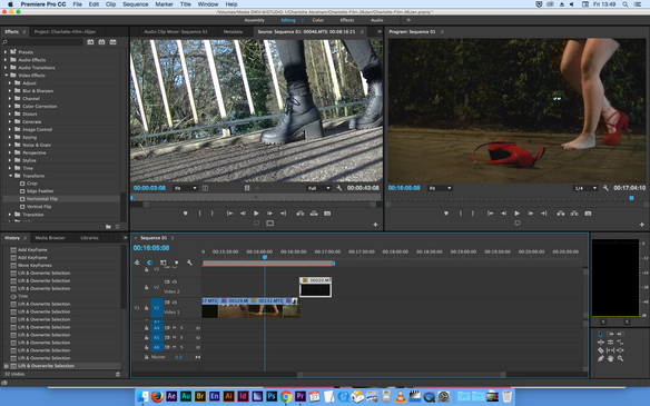


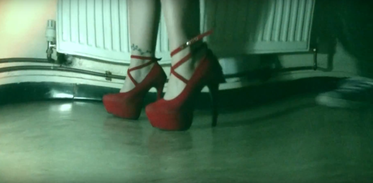
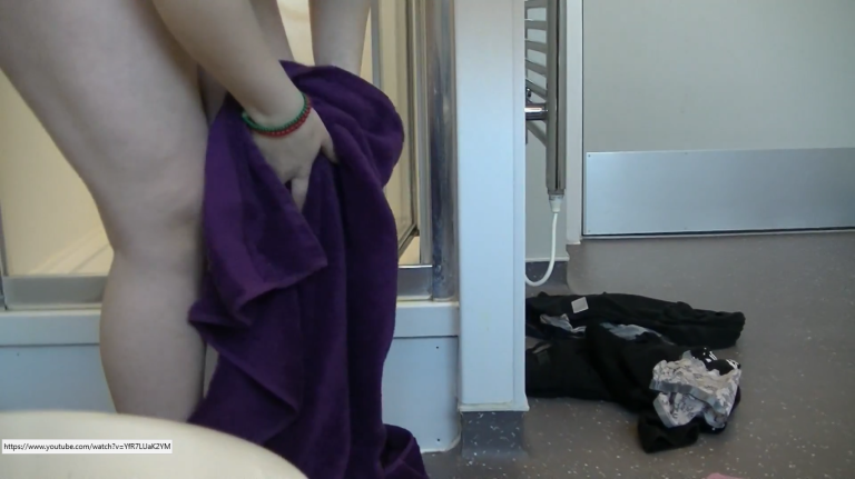
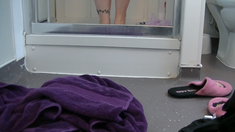

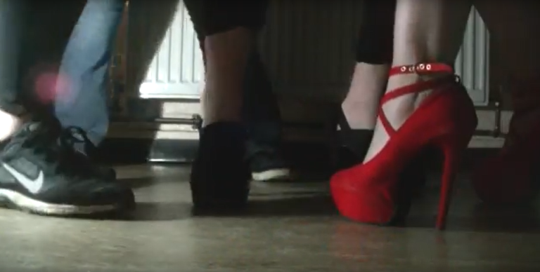


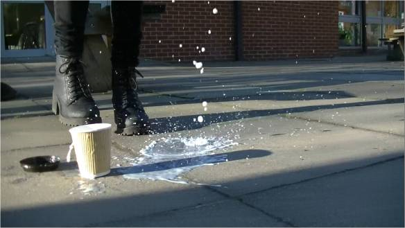

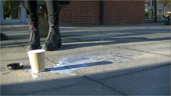

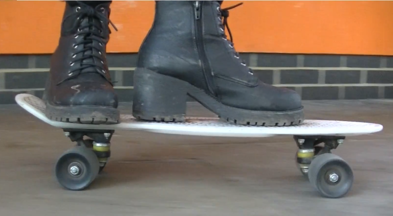
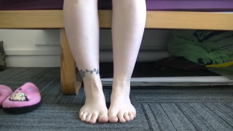
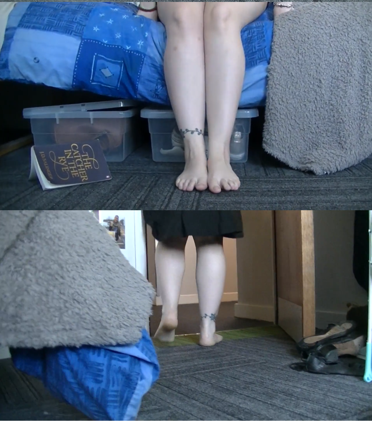
 On the way back, I was pretty eager we shoot the skateboard scene, however Charlotte has never rode one. Luckily we saw Lilly who owns one and offered to help us out. She was already wearing black jeans, but borrowed Charlotte’s shoes. The last scene we shot that day was the transition between the boots and the heels for the club scene. Since Georgia was still ill, we figured that if we shot Charlotte taking of her socks and shoes and putting her feet up on to the bed, then we could merge this footage of Georgia putting her feet down and putting the heels on.